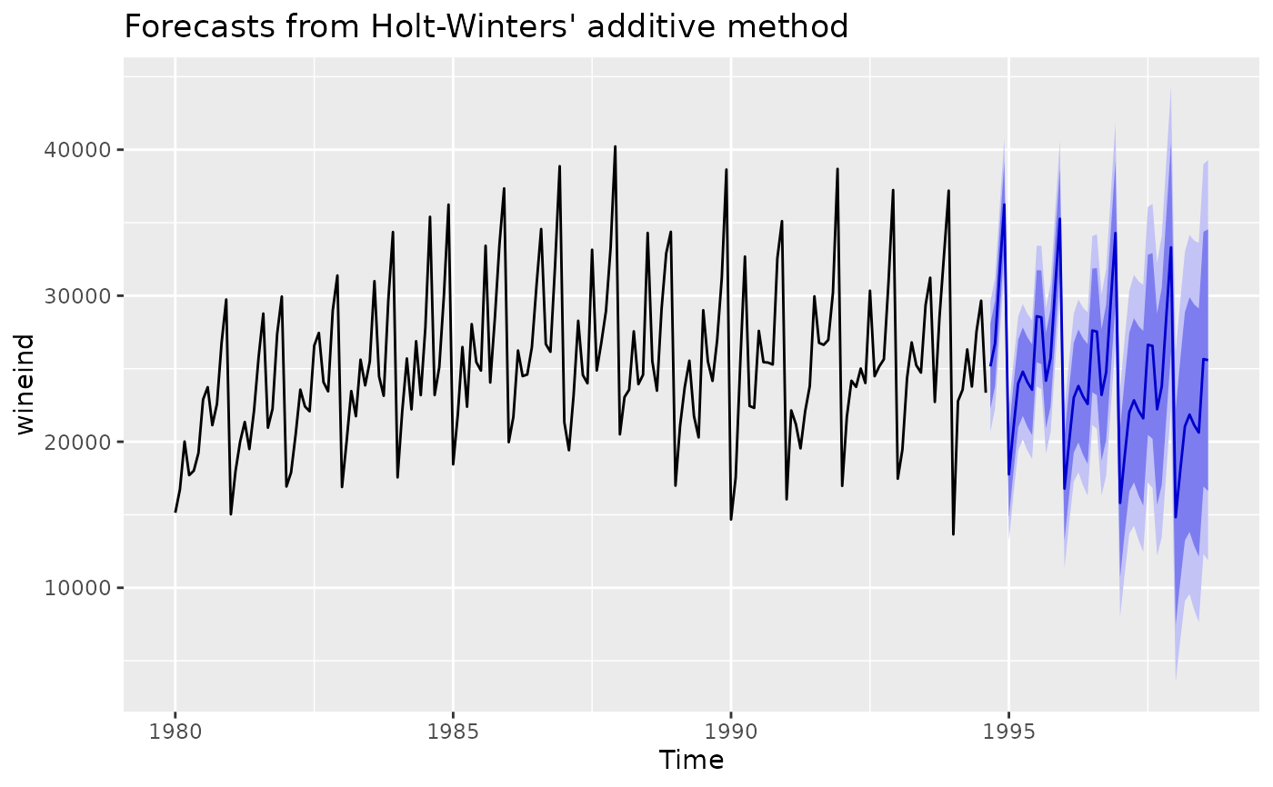
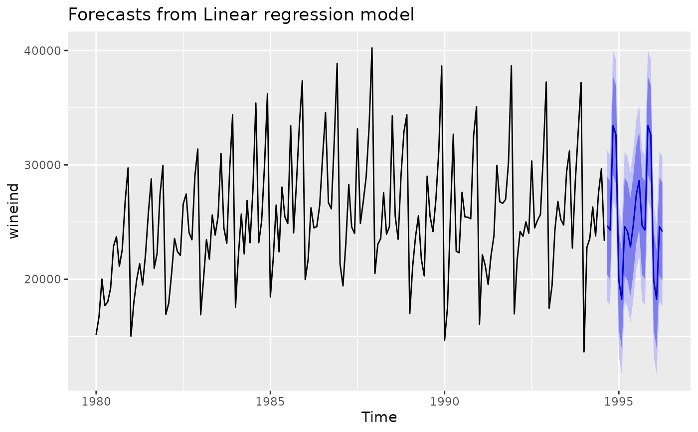
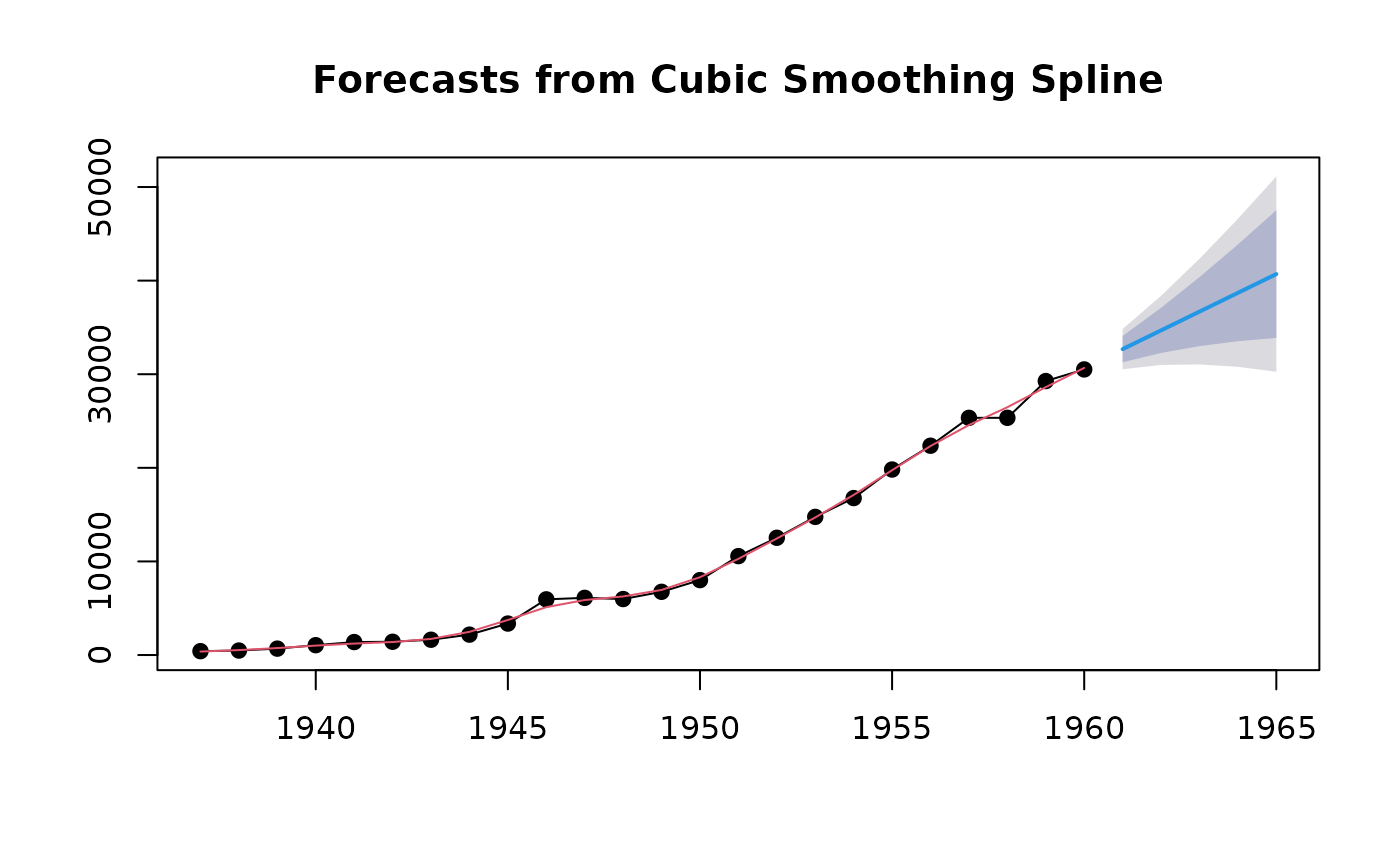
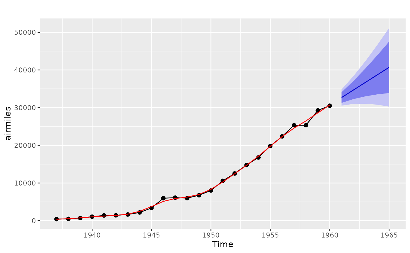
Plots historical data with forecasts and prediction intervals.
Usage
# S3 method for class 'forecast'
plot(
  x,
  include,
  PI = TRUE,
  showgap = TRUE,
  shaded = TRUE,
  shadebars = (length(x$mean) < 5),
  shadecols = NULL,
  col = 1,
  fcol = 4,
  pi.col = 1,
  pi.lty = 2,
  ylim = NULL,
  main = NULL,
  xlab = "",
  ylab = "",
  type = "l",
  flty = 1,
  flwd = 2,
  ...
)

# S3 method for class 'forecast'
autoplot(
  object,
  include,
  PI = TRUE,
  shadecols = c("#596DD5", "#D5DBFF"),
  fcol = "#0000AA",
  flwd = 0.5,
  ...
)

# S3 method for class 'splineforecast'
autoplot(object, PI = TRUE, ...)

# S3 method for class 'forecast'
autolayer(object, series = NULL, PI = TRUE, showgap = TRUE, ...)

# S3 method for class 'splineforecast'
plot(x, fitcol = 2, type = "o", pch = 19, ...)
Arguments
- x
Forecast object produced by
forecast().- include
number of values from time series to include in plot. Default is all values.
- PI
Logical flag indicating whether to plot prediction intervals.
- showgap
If
showgap = FALSE, the gap between the historical observations and the forecasts is removed.- shaded
Logical flag indicating whether prediction intervals should be shaded (
TRUE) or lines (FALSE).- shadebars
Logical flag indicating if prediction intervals should be plotted as shaded bars (if
TRUE) or a shaded polygon (ifFALSE). Ignored ifshaded = FALSE. Bars are plotted by default if there are fewer than five forecast horizons.- shadecols
Colors for shaded prediction intervals. To get default colors used prior to v3.26, set
shadecols = "oldstyle".- col
Colour for the data line.
- fcol
Colour for the forecast line.
- pi.col
If
shaded = FALSEandPI = TRUE, the prediction intervals are plotted in this colour.- pi.lty
If
shaded = FALSEandPI = TRUE, the prediction intervals are plotted using this line type.- ylim
Limits on y-axis.
- main
Main title.
- xlab
X-axis label.
- ylab
Y-axis label.
- type
1-character string giving the type of plot desired. As for
graphics::plot.default().- flty
Line type for the forecast line.
- flwd
Line width for the forecast line.
- ...
Other plotting parameters to affect the plot.
- object
Forecast object produced by
forecast(). Used for ggplot graphics (S3 method consistency).- series
Matches an unidentified forecast layer with a coloured object on the plot.
- fitcol
Line colour for fitted values.
- pch
Plotting character (if
type = "p"ortype = "o").
References
Hyndman and Athanasopoulos (2018) Forecasting: principles and practice, 2nd edition, OTexts: Melbourne, Australia. https://otexts.com/fpp2/


