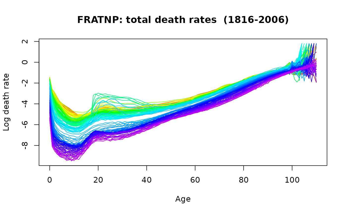
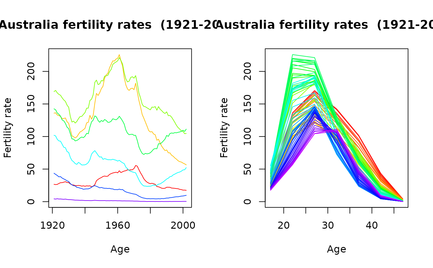
If plot.type="functions", then years are plotted using a rainbow palette so the
earliest years are red, followed by orange, yellow, green, blue
and indigo with the most recent years plotted in violet.
If plot.type="time", then each age is shown as a separate time series in a time plot.
Usage
# S3 method for class 'demogdata'
plot(
  x,
  series = ifelse(!is.null(x$rate), names(x$rate)[1], names(x$pop)[1]),
  datatype = ifelse(!is.null(x$rate), "rate", "pop"),
  years = x$year,
  ages = x$age,
  max.age = max(x$age),
  transform = (x$type == "mortality"),
  plot.type = c("functions", "time", "depth", "density"),
  type = "l",
  main = NULL,
  xlab,
  ylab,
  ...
)

# S3 method for class 'demogdata'
lines(
  x,
  series = ifelse(!is.null(x$rate), names(x$rate)[1], names(x$pop)[1]),
  datatype = ifelse(!is.null(x$rate), "rate", ""),
  years = x$year,
  ages = x$age,
  max.age = max(x$age),
  transform = (x$type == "mortality"),
  plot.type = c("functions", "time", "depth", "density"),
  ...
)

# S3 method for class 'demogdata'
points(..., pch = 1)
Arguments
- x
Demogdata object such as created using
read.demogdataorsmooth.demogdata.- series
Name of series to plot. Default: the first matrix within
datatype.- datatype
Name of demogdata object which contains series. Default “rate”. Alternative: “pop”.
- years
Vector indicating which years to plot. Default: all available years.
- ages
Vector indicating which ages to plot. Default: all available ages.
- max.age
Maximum age to plot. Default: all available ages.
- transform
Should a transformation of the data be plotted? Default is TRUE if the object contains mortality data and datatype="rate", and FALSE otherwise.
- plot.type
Type of plot: either “functions” or “time”.
- type
What type of plot should be drawn. See
plotfor possible types.- main
Main title for the plot.
- xlab
Label for x-axis.
- ylab
Label for y-axis.
- ...
Other plotting parameters. In
points.demogdata, all arguments are passed tolines.demogdata.- pch
Plotting character.

