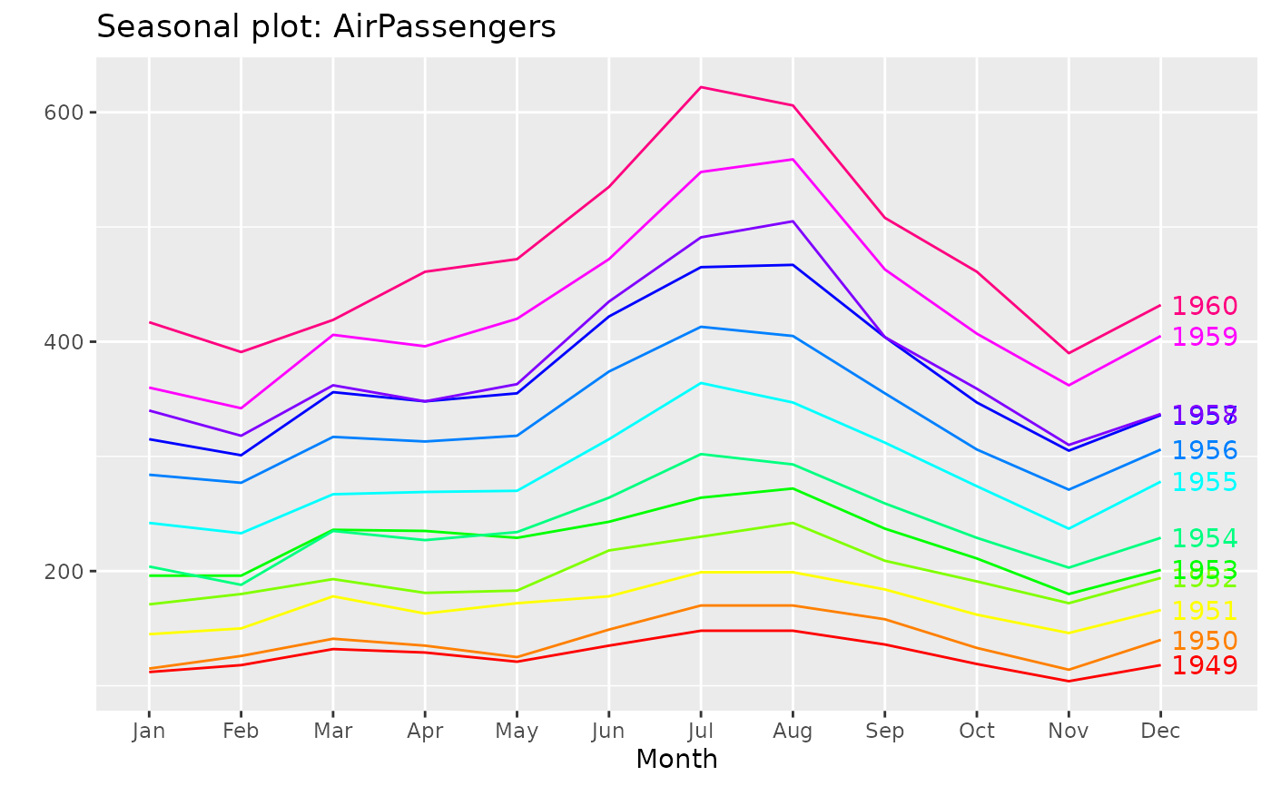
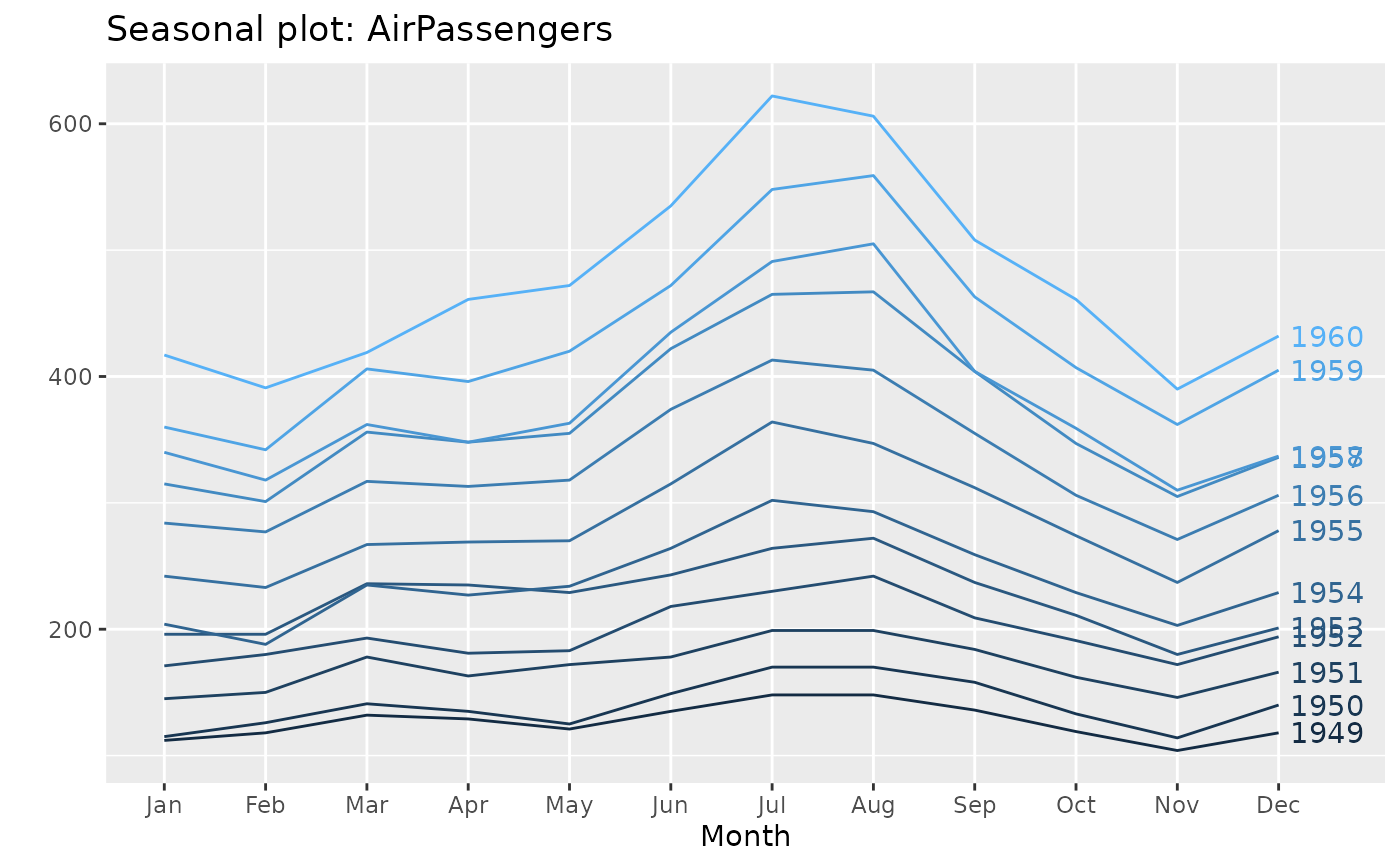
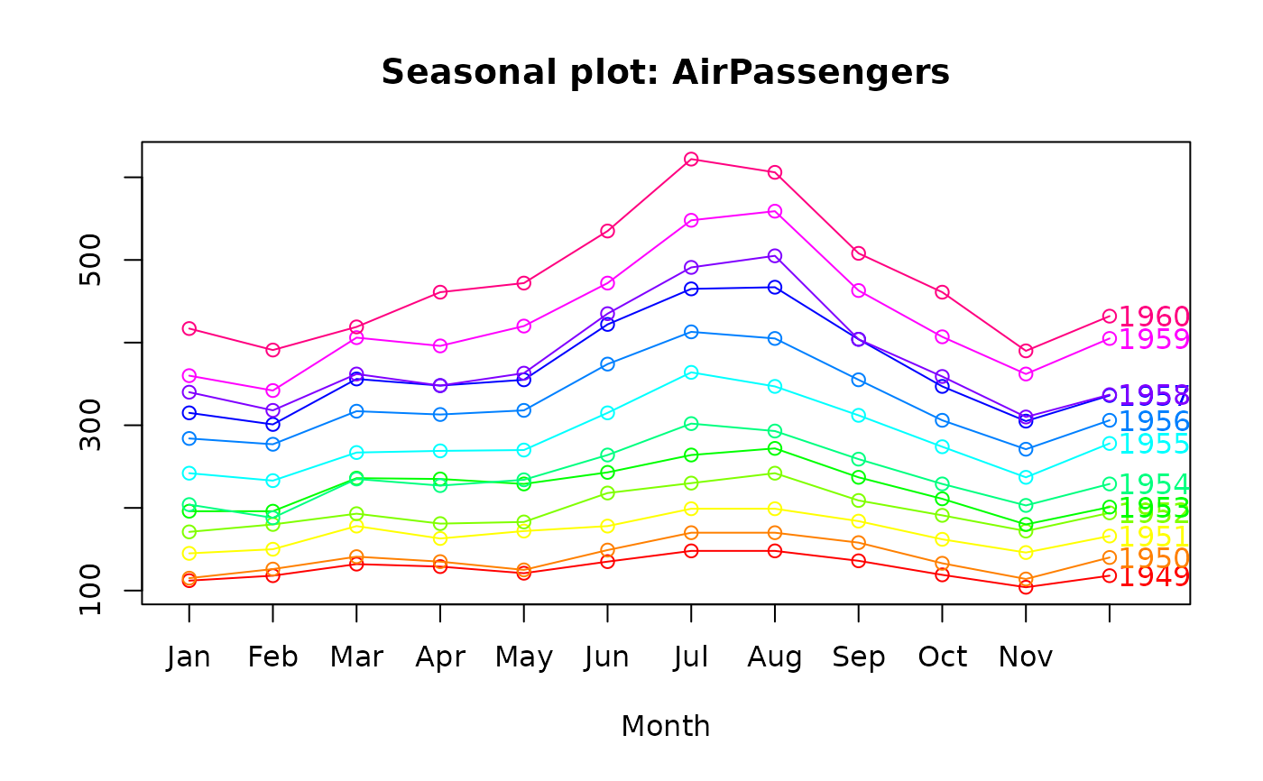
Plots a seasonal plot as described in Hyndman and Athanasopoulos (2014, chapter 2). This is like a time plot except that the data are plotted against the seasons in separate years.
Usage
ggseasonplot(
  x,
  season.labels = NULL,
  year.labels = FALSE,
  year.labels.left = FALSE,
  type = NULL,
  col = NULL,
  continuous = FALSE,
  polar = FALSE,
  labelgap = 0.04,
  ...
)

seasonplot(
  x,
  s,
  season.labels = NULL,
  year.labels = FALSE,
  year.labels.left = FALSE,
  type = "o",
  main,
  xlab = NULL,
  ylab = "",
  col = 1,
  labelgap = 0.1,
  ...
)
Arguments
- x
a numeric vector or time series of class
ts.- season.labels
Labels for each season in the "year"
- year.labels
Logical flag indicating whether labels for each year of data should be plotted on the right.
- year.labels.left
Logical flag indicating whether labels for each year of data should be plotted on the left.
- type
plot type (as for
plot). Not yet supported for ggseasonplot.- col
Colour
- continuous
Should the colour scheme for years be continuous or discrete?
- polar
Plot the graph on seasonal coordinates
- labelgap
Distance between year labels and plotted lines
- ...
additional arguments to
plot.- s
seasonal frequency of x
- main
Main title.
- xlab
X-axis label.
- ylab
Y-axis label.
References
Hyndman and Athanasopoulos (2018) Forecasting: principles and practice, 2nd edition, OTexts: Melbourne, Australia. https://otexts.com/fpp2/